National Constitution Center Presidential Decision
A decision making simulation that puts visitors in the Oval Office — across installation, desktop and mobile.
Product Design • Interaction Design

Project Overview
A presidential decision-making simulation designed for the National Constitution Center's permanent Governing the Nation gallery — built for museum kiosk, mobile, and desktop.
Client: National Constitution Center (NCC), Philadelphia, PA
Gallery: Governing the Nation — Separation of Powers
Timeline: 8 weeks (2026)
My Role: Product Designer
The Resolute Desk experience places visitors in the role of the President of the United States for a simulated day in the Oval Office. Set against the visual backdrop of the actual Resolute Desk, visitors work through a presidential to-do list, receive advice from in-character advisors, make high-stakes decisions, and discover how real presidents handled the same scenarios.
The experience is part of the National Constitution Center's new Governing the Nation gallery, which opened May 15, 2026 as part of America's 250th anniversary programming — made possible by a $15 million gift, the largest single donation in NCC history. The Resolute Desk interactive was cited by name in the official NCC press release as one of the gallery's signature experiences.

My Role
UX and interaction design across kiosk, mobile and desktop
Visual design system and UI component
Prototyping and cross-functional collaboration with developers and PMs
Client presentations and stakeholder reviews
User testing and iterative design based on feedback
ADA and WCAG 2.1 AA compliance across kiosk and web
Design Team
Trivium Interactive
Challenge
Make presidential decision-making feel personal and relevant to a museum visitor who might only spend 3–5 minutes at a kiosk
Design for a wide audience: students, families and casual visitors sharing one device
Extend the experience to mobile and desktop without losing kiosk immersion
Navigate strict client content and legal requirements across multiple review rounds
Balance content heavy educational depth with engagement
Solution
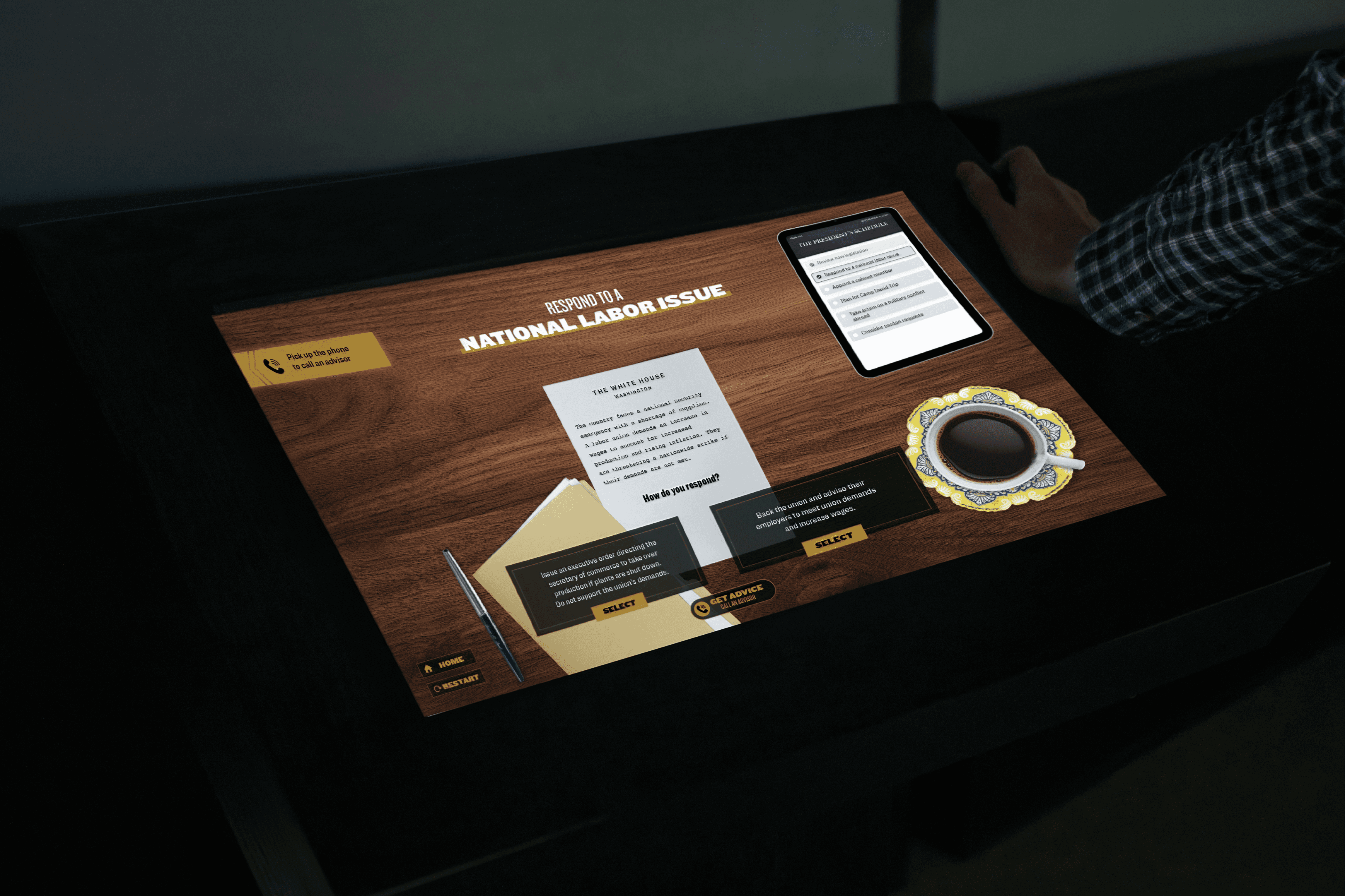
Designed a presidential simulation around physical desk artifacts to make constitutional concepts personally relevant and experiential.
5 visible tasks plus rotating surprise tasks that unlock mid-session for continued engagement
Opt-in advice system so visitors could choose to go deeper without slowing down the experience
Adapted the full experience to mobile and desktop where physical artifacts were no longer available
Research Process
Findings & Insights
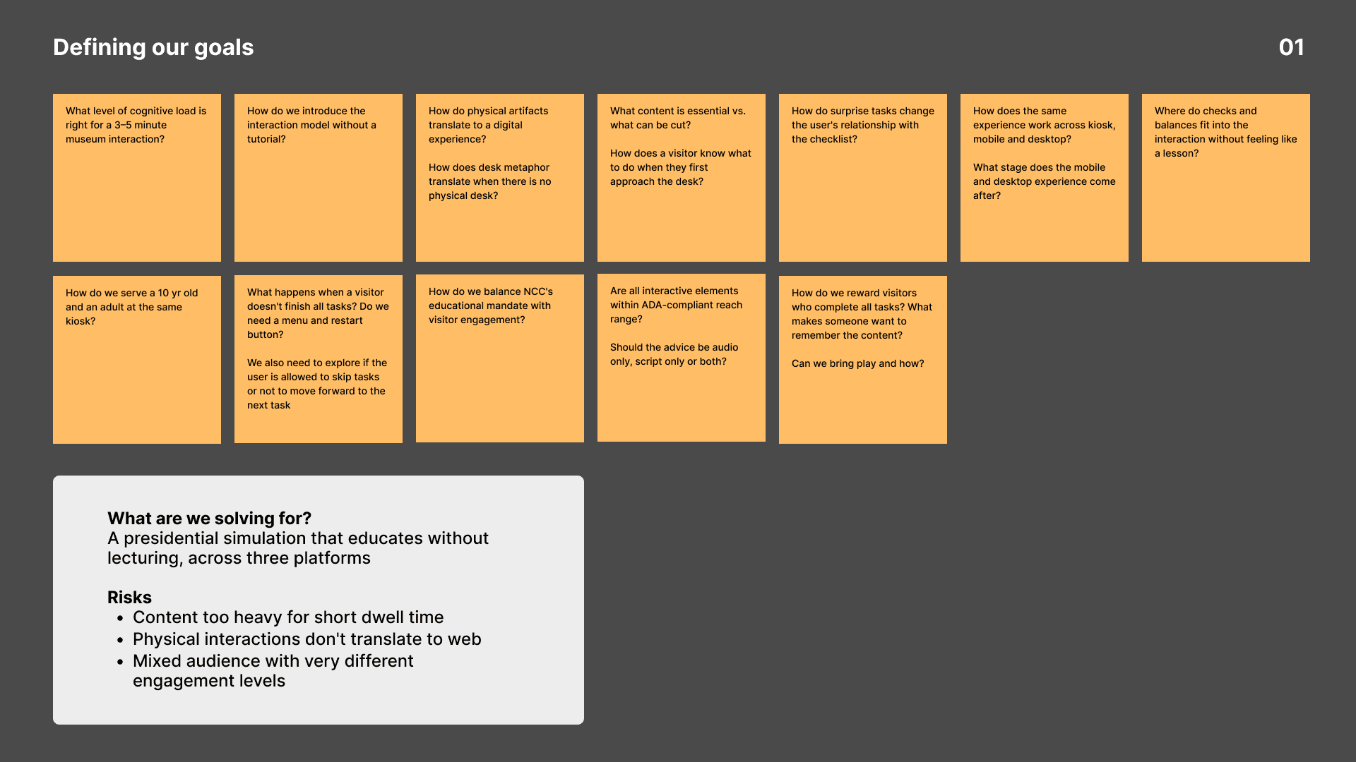
1. Clarifying our goals
We kicked off with a client brief meeting with NCC where we learned about their target visitors, educational goals and the physical gallery layout. I worked with the team to understand what the experience needed to achieve both educationally and experientially.
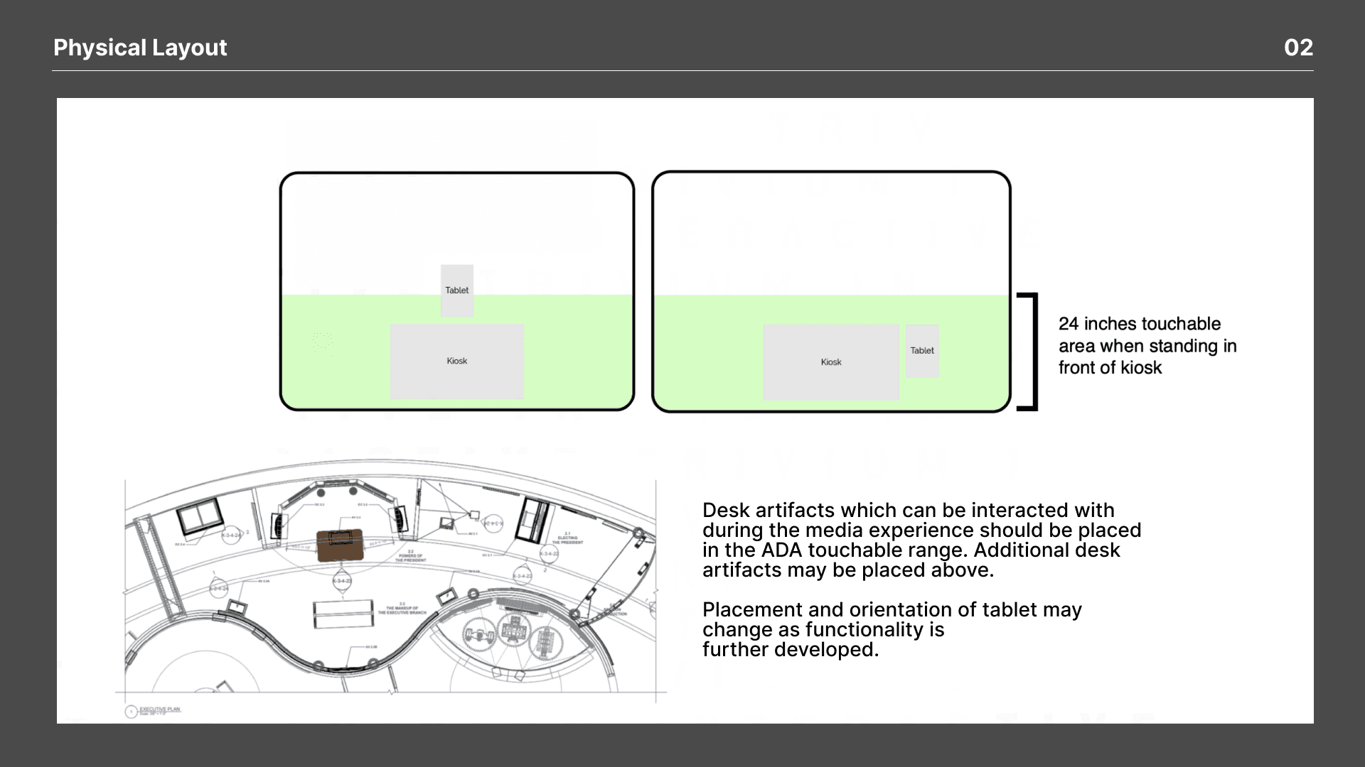
A key early insight was understanding the physical desk itself. Artifacts like the pen, stamp, and phone needed to sit within ADA touchable range, which directly shaped how I thought about the interaction model. The tablet, originally a physical element on the desk, became the visual anchor for the task checklist in the digital experience.
NCC's historians and education team fed content to our content team to ensure historical accuracy, which I reviewed to understand the scope and depth of each presidential task.
2. Defining Research
Visitor Research Our team reviewed NCC's existing visitor data to understand audience demographics, dwell times, and engagement patterns. This surfaced key user profiles which included school groups, civically engaged adults and history enthusiasts which drove interaction decisions throughout design.
Competitive Analysis We benchmarked similar interactive experiences, drawing on patterns around touch surfaces, layered content and object-anchored storytelling to inform our design direction.
Client Working Sessions Weekly sessions with NCC took place.Their in-house educators and historians who worked directly with primary source archives guided the content, while our team translated that into concepts and prototype.
3. Discovery & exploration
Site visits to NCC and research into the desk's history pointed us to a clear direction: don't explain presidential power, let visitors feel it. The concept puts visitors in the seat of the President for a day, greeted by a live touchscreen displaying their agenda with physical props within reach. Each session is unique, tasks range from routine announcements to high-stakes policy decisions and every choice has a consequence.
Defining the Experience
After aligning with NCC, we settled on a clear interaction model: visitors work through a presidential to-do list on the desk surface, make decisions and see the consequences including what a real president did in a comparable situation, with archival photos and constitutional context.
The task list has two layers: five standard policy tasks and four hidden surprise tasks that unlock mid-session, with only two appearing per experience. The surprise tasks reward visitors who stay engaged and make the experience feel human, not bureaucratic.
Wireframes
With the experience structure defined, we moved into iterative wireframing where we were testing layouts, validating concepts with NCC and refining based on feedback. Content collaboration with the client ran alongside every iteration, shaping what appeared on screen and how visitors would move through it. Four rounds of iteration shaped its final form.
Version 1 The first wireframes established the core loop with the to-do list living on a separate physical tablet alongside the kiosk.
Version 2 The tablet checklist moved into the kiosk as a persistent sidebar so visitors could track their progress throughout the experience.
Version 3 As content from NCC started arriving we began exploring how documents and phone transcripts would appear on screen.
Version 4 We introduced an opt-in advice button and paired audio with transcripts giving visitors more depth before making a decision.
Version 5 Physical desk props like documents and newspapers began taking visual form pointing toward the final design language.
Visual Design and Iterations
Two visual directions were presented to NCC. Option 1 used a wood texture surface with scattered desk props like a notepad, pen, newspaper and presidential brief, creating an immersive Oval Office feel. Option 2 took a cleaner editorial approach with structured layouts and modern typography. NCC went with Option 1.
The gallery's existing colors and materials guided direction, but the interactive needed its own visual language. We treated the wood grain surface as the literal canvas, designing every interface element as a physical object resting on it: notepad, brief folder, tablet, coffee cup. The goal was to imagine what a president would have on their desk and turn it into a UI element. Gold marked primary actions and task titles, dark overlays signaled consequence and a "Constitution Daily" newspaper graphic delivered the headline response to each decision. Typography stayed bold and condensed, formal but not bureaucratic.
Once the desk aesthetic was selected, our focus shifted to refining the task screen and consequence reveal the two screens visitors interact with most. Four iterations shaped the final design.

Iteration 2: We simplified the homepage title treatment to "Be the President" and introduced the "Get Advice" button, separating the opt-in historical context from the core decision flow. The consequence screen dropped the photo in favor of a cleaner text-only reveal, though this version felt visually flat compared to richness of desk.
Iteration 4: The final iteration refined task naming into clear, consistent titles (e.g. "Review New Legislation") and polished the newspaper reveal into a styled front-page layout with headline, photo, and byline treatment. The coffee cup gained a ring stain detail, and the task sidebar was tightened for legibility — this became the version that shipped to the gallery floor.

On most tasks, before deciding, visitors can tap "Get Advice" to hear from a Presidential Advisor, either through a short call, an email on the tablet, or a written memo. The advice gives context without telling visitors what to choose. Once they decide, the interaction becomes physical: visitors sign the desk's pen to approve or press a stamp to veto or pardon. This small gesture turns an on-screen choice into something closer to the real act of governing.
Client Collaboration
NCC cared a lot about getting details right. Content accuracy, legal clearance and educational integrity mattered most. The project went through internal wireframe review, alpha, beta and pre-install sign-off. Each of these phase led to changes.
What changed in Alpha
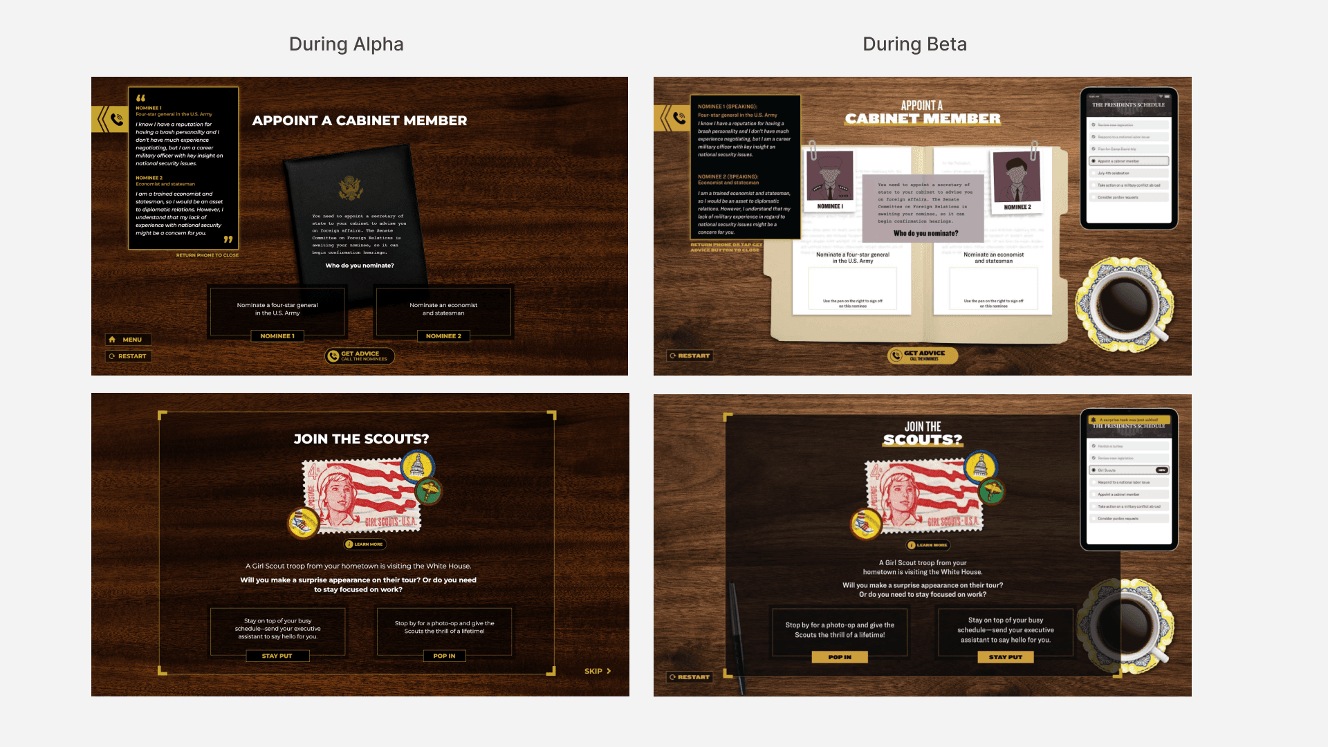
Alpha brought up legal and content limits. Federal seals couldn't be used in the interactive, so I redesigned stamps as a stylized prop instead. Headlines needed clear sourcing, leading me to switch several consequence screens to original "Constitution Daily" headlines. Advisor scripts were too long for a kiosk, which led me to cut them to three or four sentences and moved extra detail into an opt-in "Learn More" section. Surprise tasks also included a dedicated "Skip" button so visitors wouldn't feel stuck on a task they didn't want.
What changed in Beta
Beta testing helped refine things further. A "Menu" button next to Restart, got removed once beta showed it was rarely used. We also added a notification banner and a "NEW" badge on the task list so visitors knew when a surprise task had been added, instead of just having it appear. Testing showed people actually liked the surprise tasks, so instead of adding a dedicated skip button, we made sure visitors could move on simply by tapping the next task on the tablet list. The cabinet folder became detailed: nominee profiles gained paperclipped photos with sign-off instructions under each one. I also checked contrast, touch targets, and timing to meet WCAG 2.1 AA across kiosk and web.
The Experience
Screen by Screen
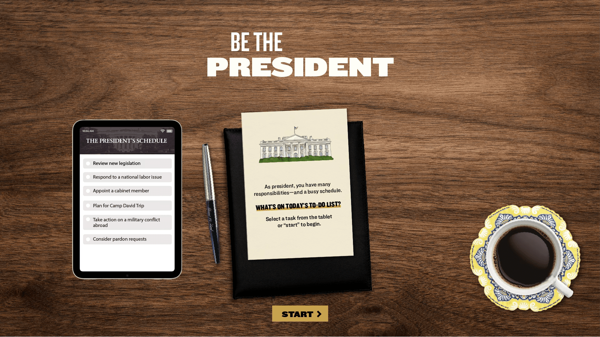
1 Home Screen
The opening screen frames the experience: a wide view of the desk with the to-do list on the tablet, documents animating into the screen with a pen and a coffee cup. Visitors understand the premise before reading any instructions.
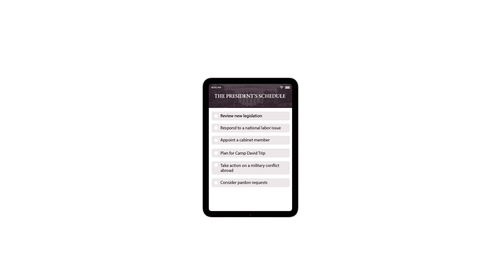
2 Task List
Tapping the tablet opens the president's schedule: A surprise task can appear alongside the five standard tasks once it unlocks mid-session.
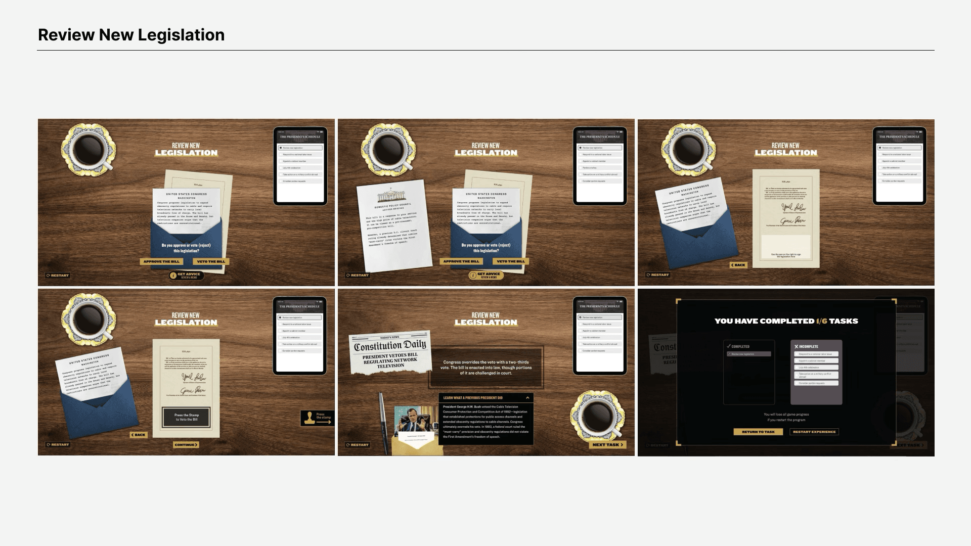
3 Decision to Consequence
Each task moves from a brief, to a decision, to a sign or stamp action, to a consequence reveal showing what a real president did in a similar situation. The 'Get Advice' affordance is always present but never required for visitors to respect all engagement depths.
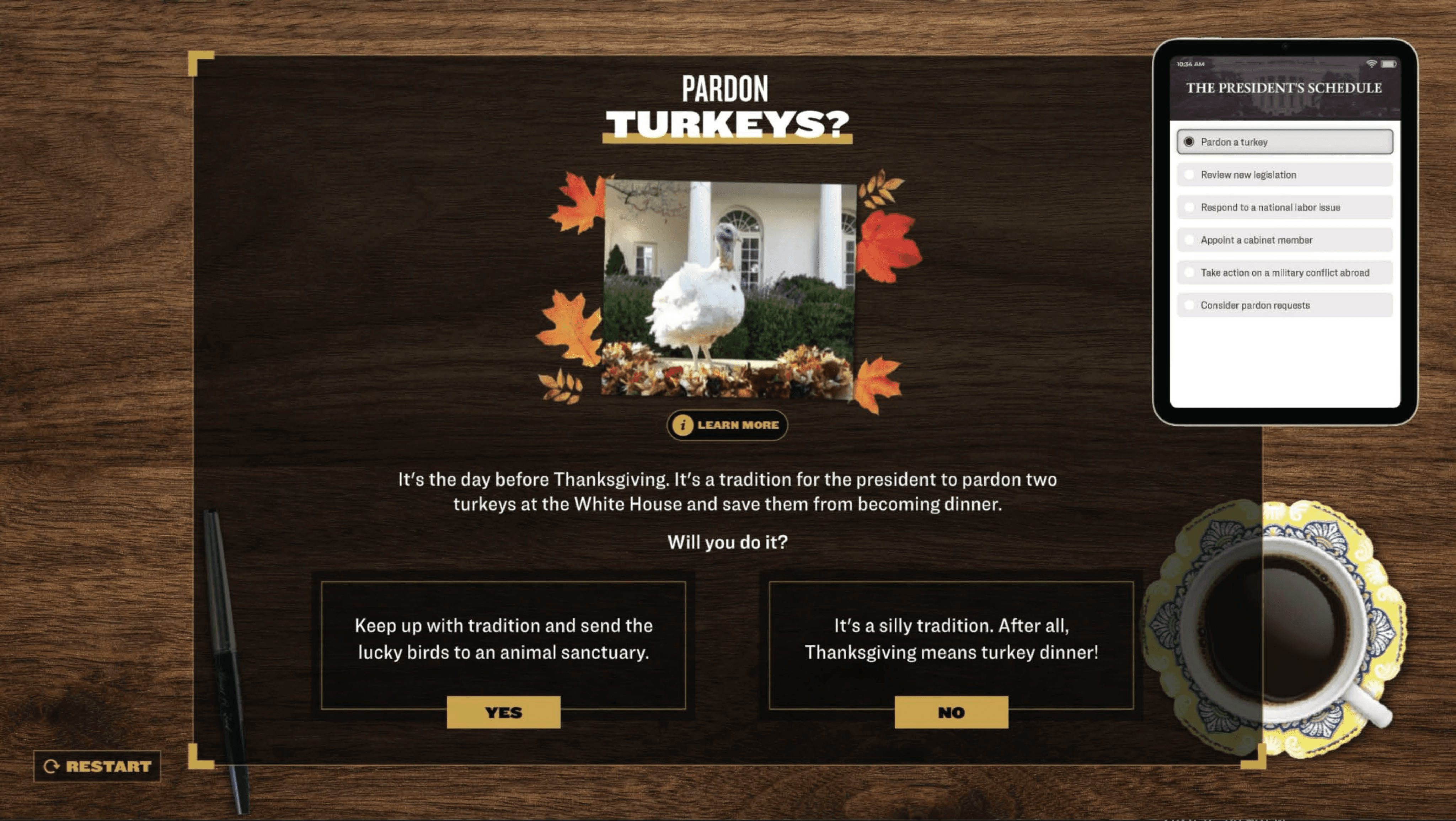
4 Surprise Task
Mid-session, a banner announces a new task has been added. Surprise tasks like Pardon a Turkey or Plan a Camp David Getaway are lighter in tone but grounded in real history.
Adapting to Mobile & Desktop
Once the kiosk experience was finalized, NCC wanted it to reach people beyond the museum for educational use. We adapted it for mobile and desktop, starting with wireframes to rework the layout without the physical desk props.
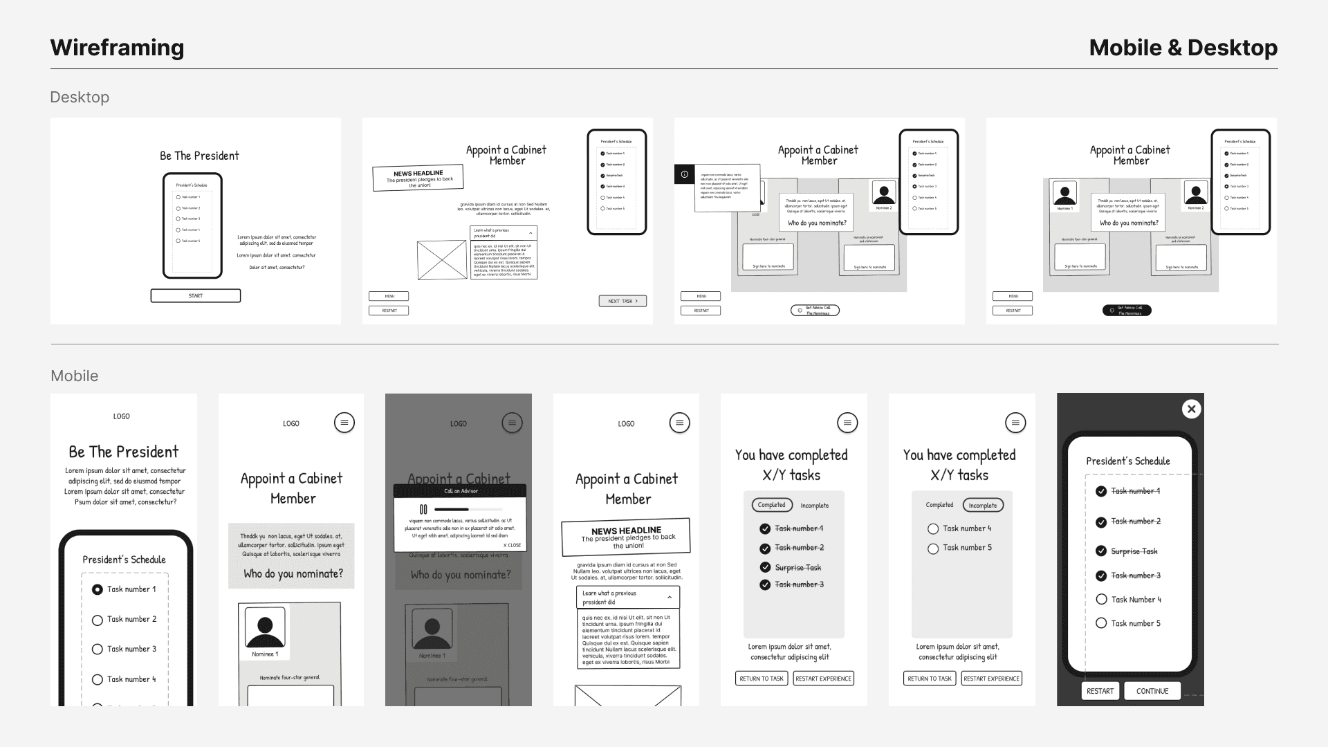
Wireframing the layout
Once the structure held up, we tested it as an interactive prototype before moving into final visual design.
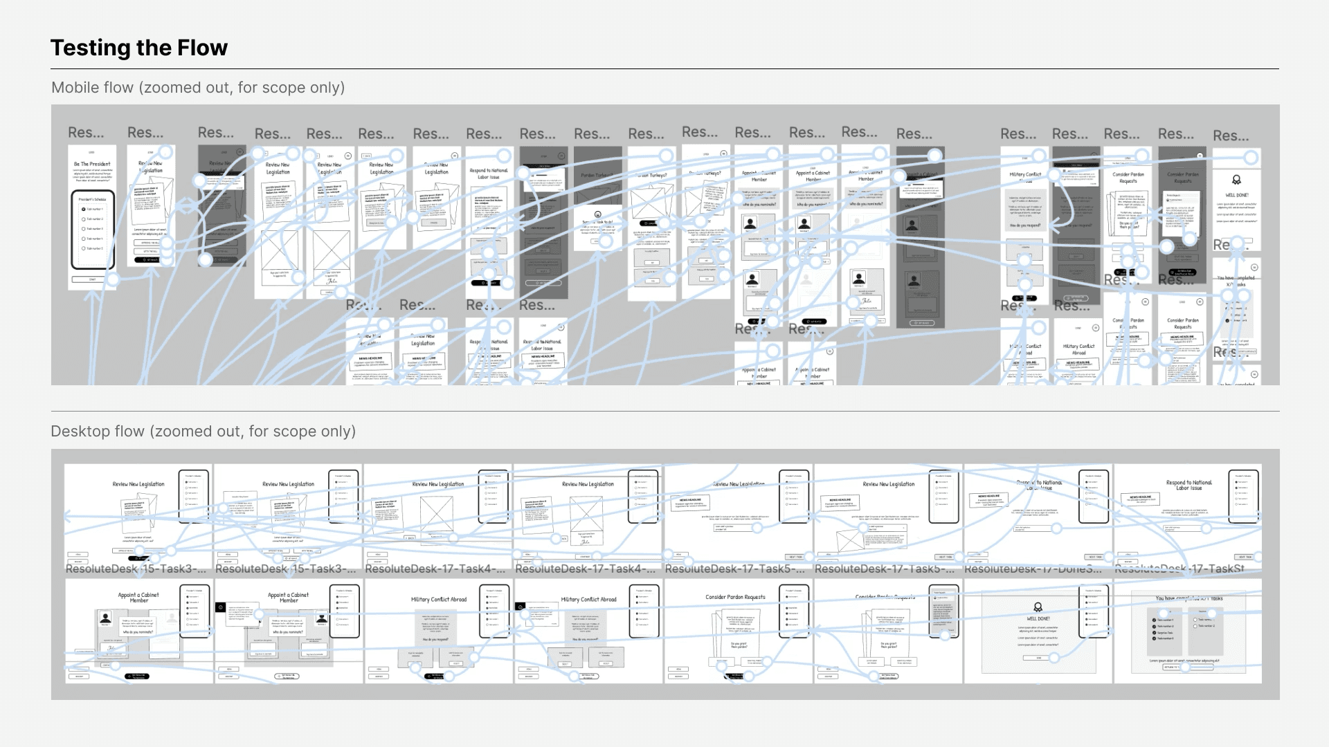
Testing the flow
The core experience stayed the same. There were same tasks and similar wood and gold visual system that carried over. Desktop stayed close to the kiosk, since its layout and screen size could hold the same wide composition. Mobile adapted the most. With no physical pen, stamp, tablet or phone, every interaction had to happen entirely on screen. Get Advice became a text-only pop-up instead of a phone call. The task checklist moved from a tablet sidebar into the hamburger menu. The layout reflowed into a single portrait column and the surprise task mechanic would just appear in a full-screen popup, since there was no visible checklist.


Outcomes
Funded by a $15M gift from Kenneth C. Griffin, the largest single donation in NCC history.
The Resolute Desk experience was cited by name in the official NCC press release as a signature gallery experience.
Because Resolute Desk also works on mobile and desktop, it can extend beyond the museum floor into NCC's classroom programs, the same programs that already reach 6 million students a year.
Design changes were driven by content and testing: skip buttons added, menu button removed, pen instruction text added, ADA compliance confirmed across all surfaces.
Lessons Learned
Legal and brand restrictions gave the design more personality. NCC asked us to drop the government seal and other official graphics from screens. It pushed us to invent original props, including the fictional outlet "Constitution Daily," a catchy way to deliver the news and the user's decision.
Test what clients can't see. The pen instructions, skip button, menu button removal, and learn more button placement all came from user testing, not client feedback.
As a designer, I assumed dense, real-world content needed to be trimmed down to hold attention. Instead, giving users a role and a real decision to make turned the same content into something people wanted to dig into, instead of skip past.
Mobile and desktop ran on a separate deliverable timeline with a different dev team. I assumed they just needed a smaller kiosk layout but the physical parts, advice call, pen and stamp, had no screen equivalent. We redesigned instead of shrinking them. Next time, I'd think through those translations earlier.